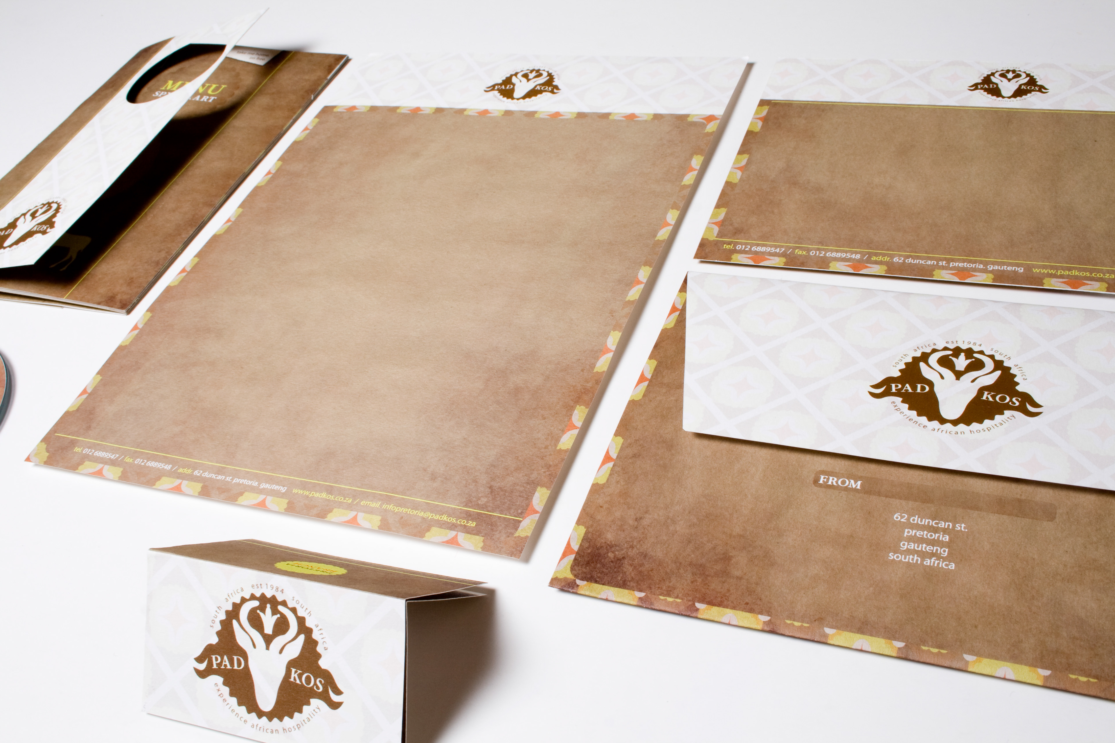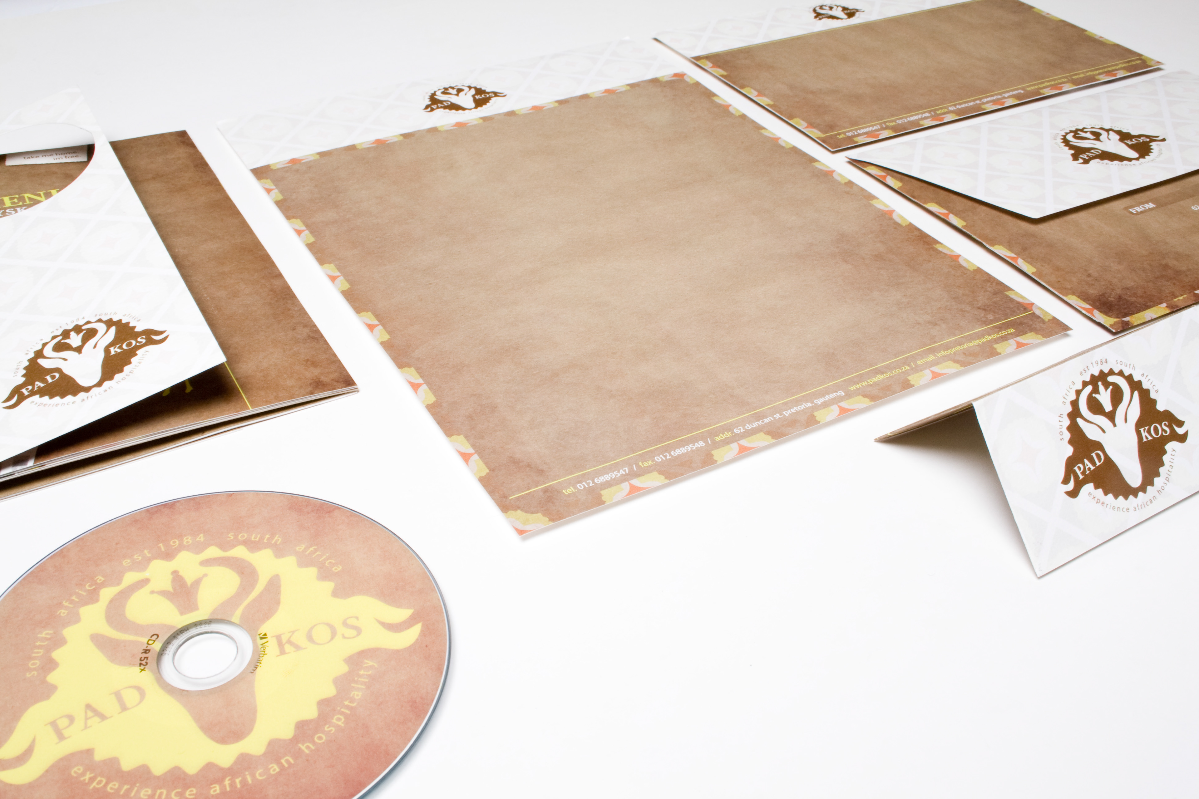
PAD KOS BRANDING
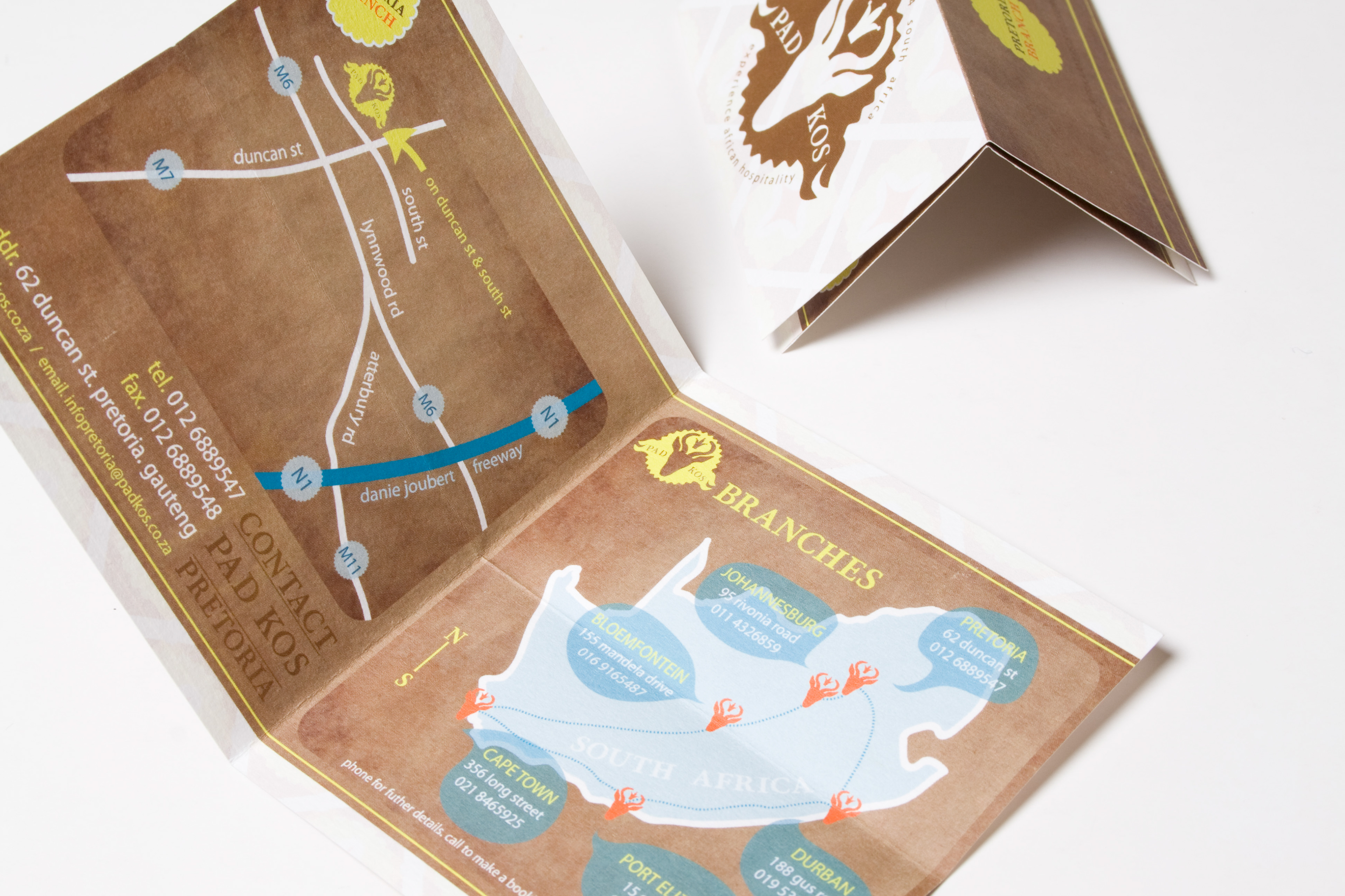
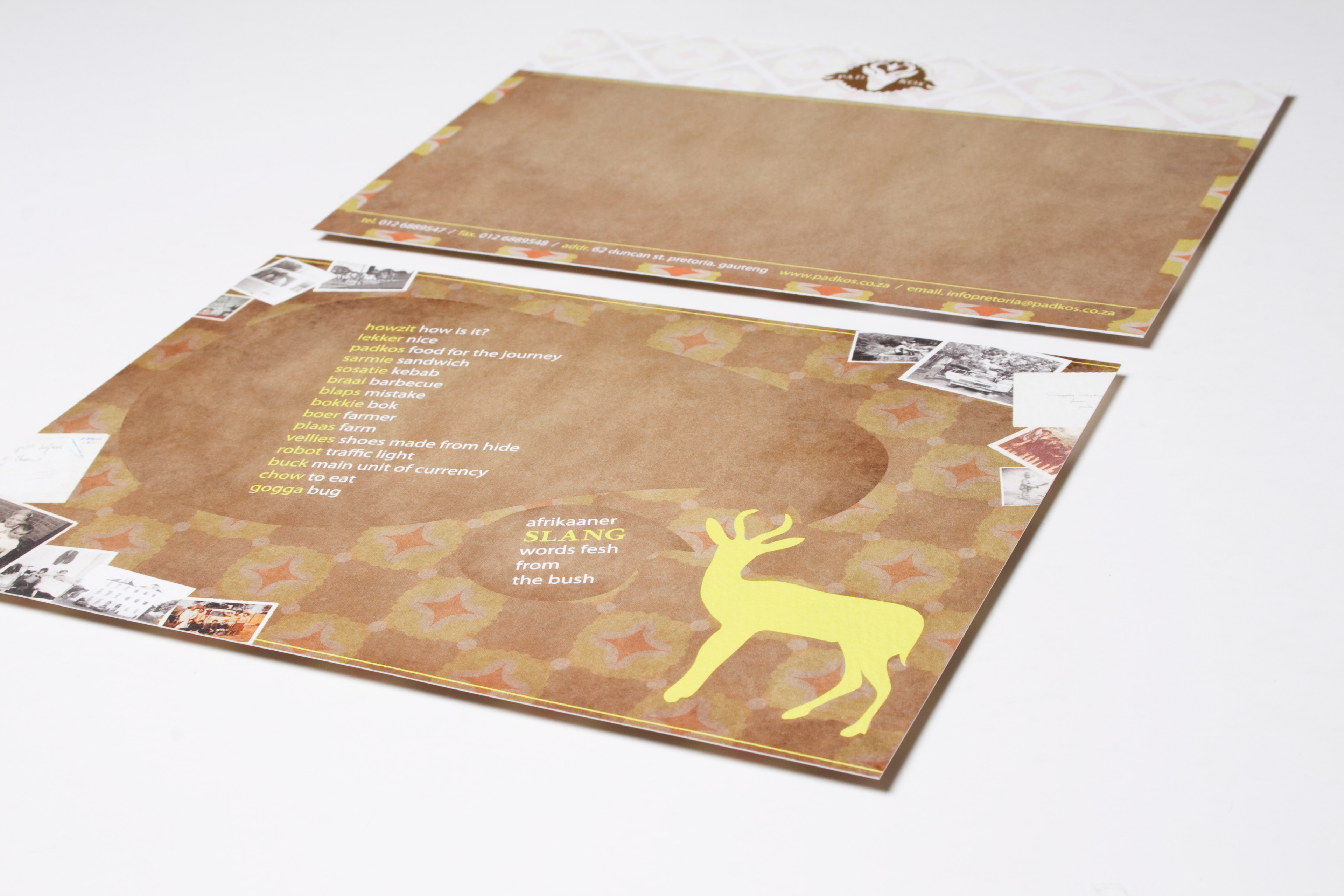
Branding for a Hospitality industry. The assignment was to create a corporate identity for a hospitality industry. The designs was created for a restaurant PAD KOS that serves the traditional ‘boere’ meals. The elements of the rough farm lifestyle was carried through the brown and textured paper with a modern twist of bright yellow, gold and orange colors. The logo was inspired by South Africa’s national animal the ‘springbok’. The logo is compressed in a emblem form to give the restaurant a high, awarded, and established feel.
Pad Kos Branding
The assignment was to create a corporate identity for a hospitality industry. The designs was created for a restaurant PAD KOS that serves the traditional South African ‘boere’ meals. The elements of the rough farm lifestyle was carried through the brown and textured paper with a modern twist of bright yellow, gold and orange colors. The logo was inspired by South Africa’s national animal the ‘springbok’. The logo is compressed in a emblem form to give the restaurant a high, awarded, and established feel.
Logo
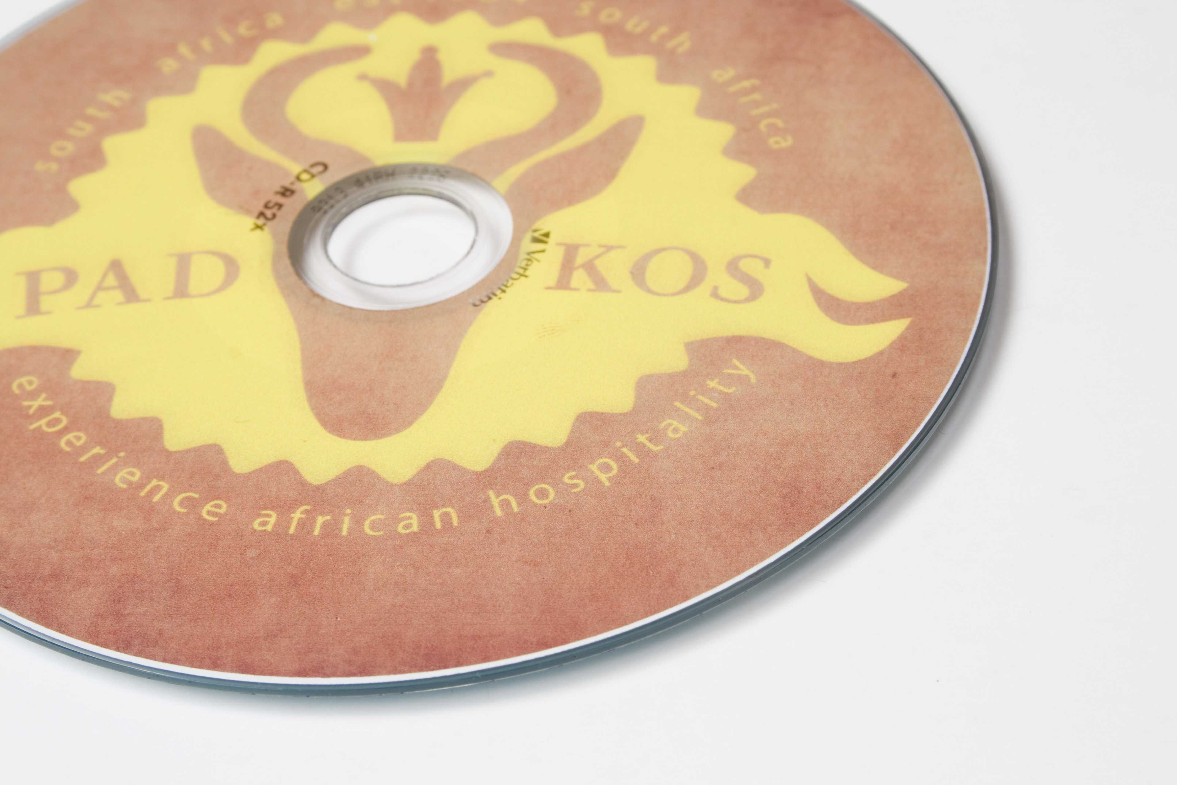
CD
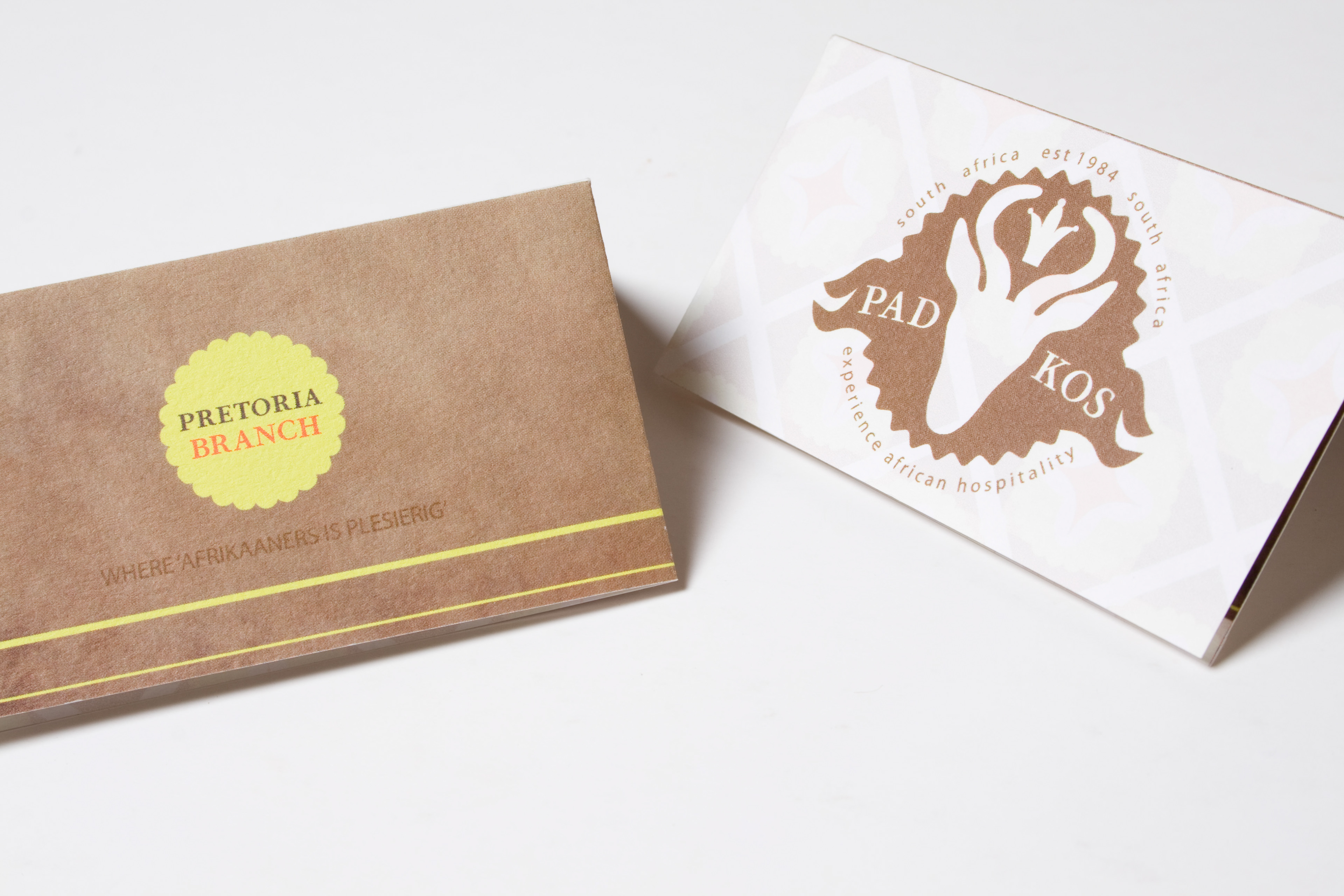
Business Cards
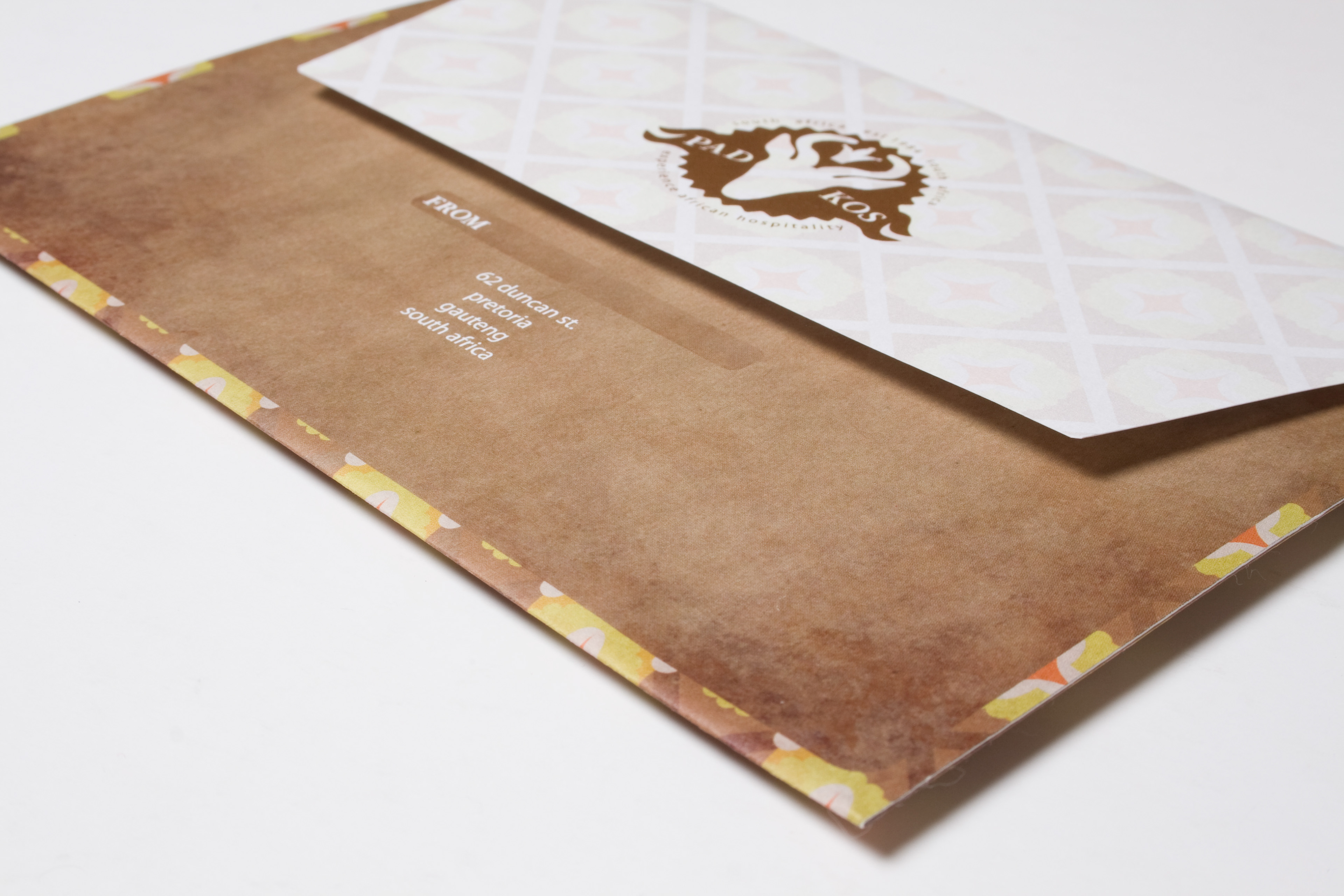
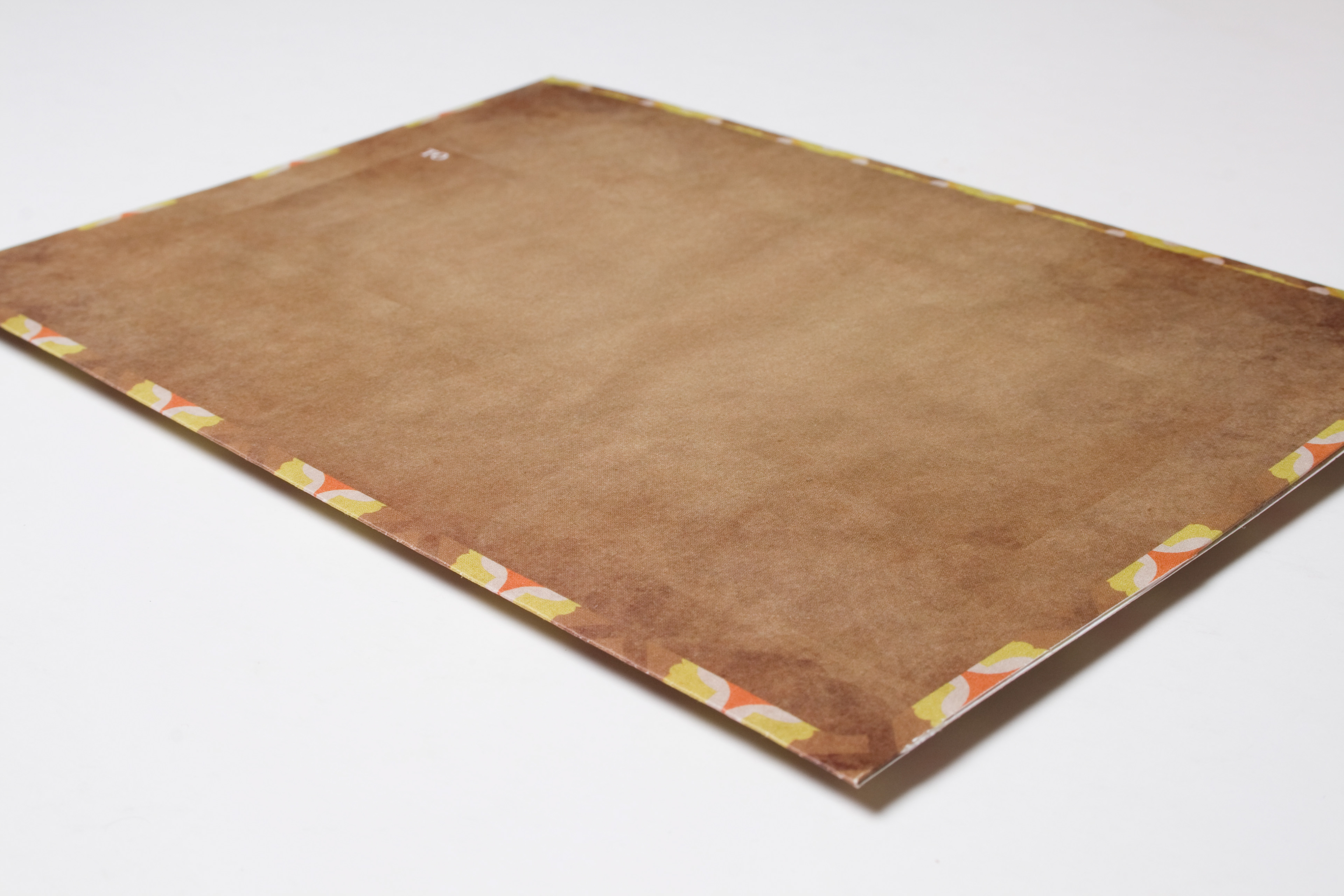
Envelope
Compliment Slip
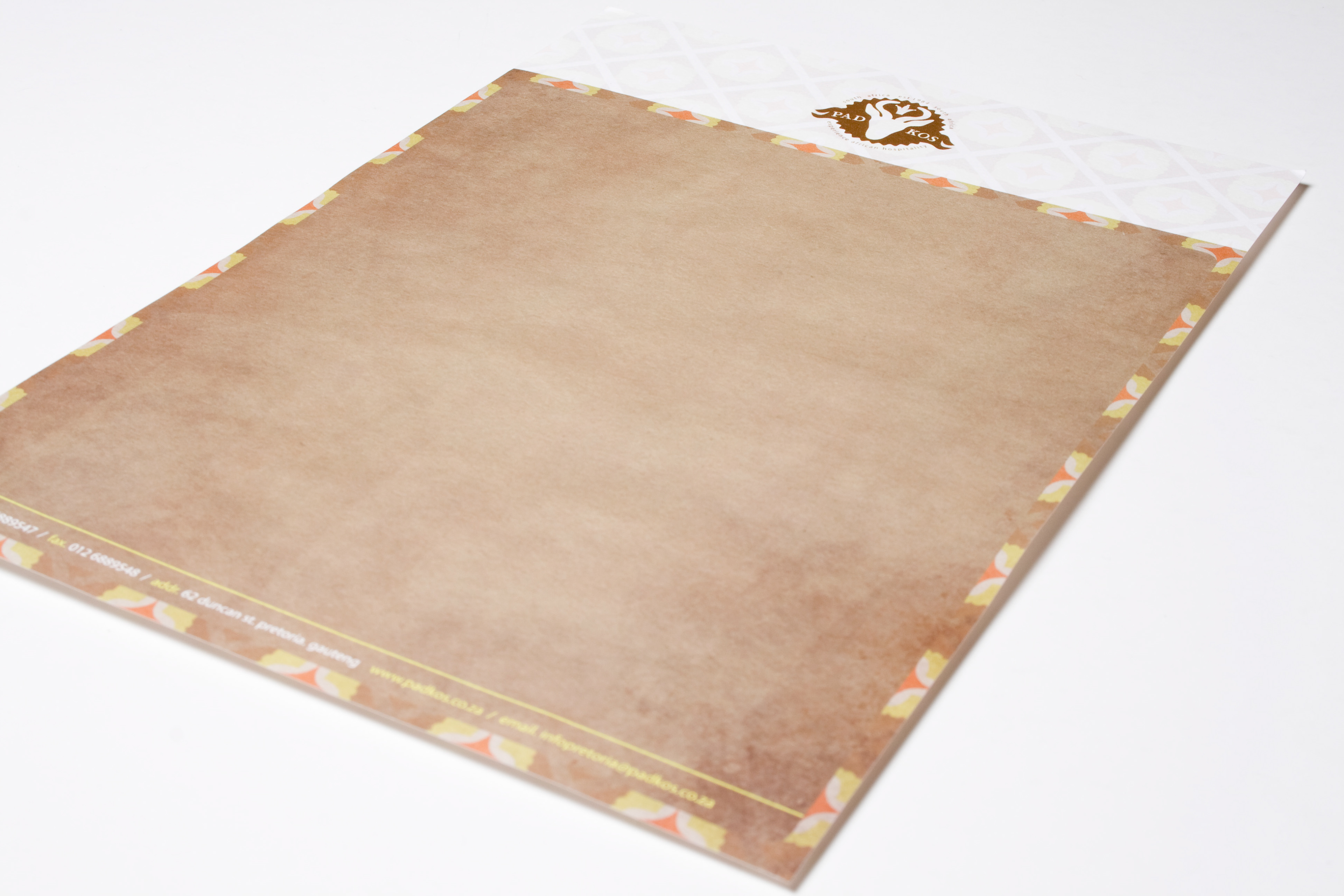
Letter Head
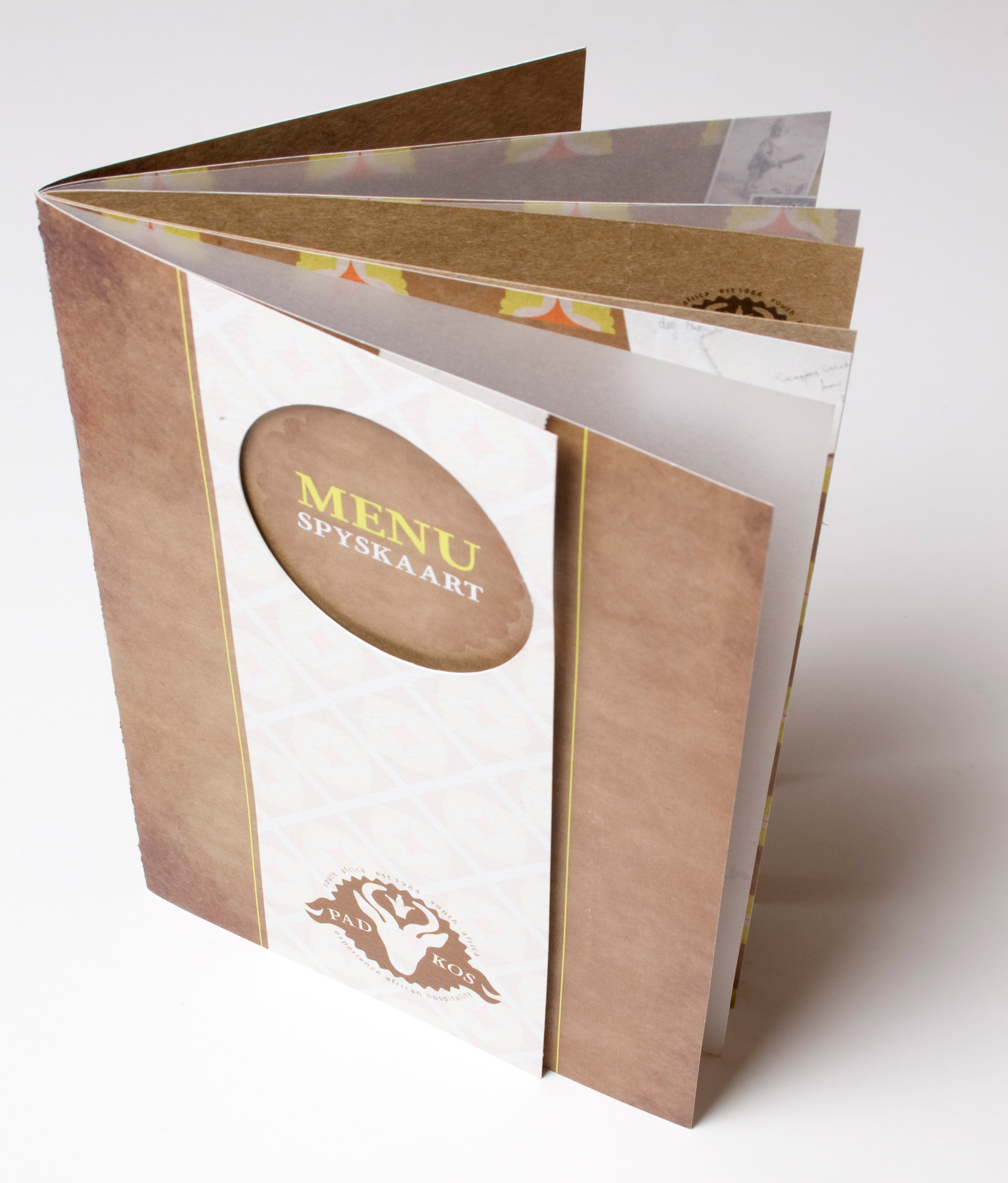
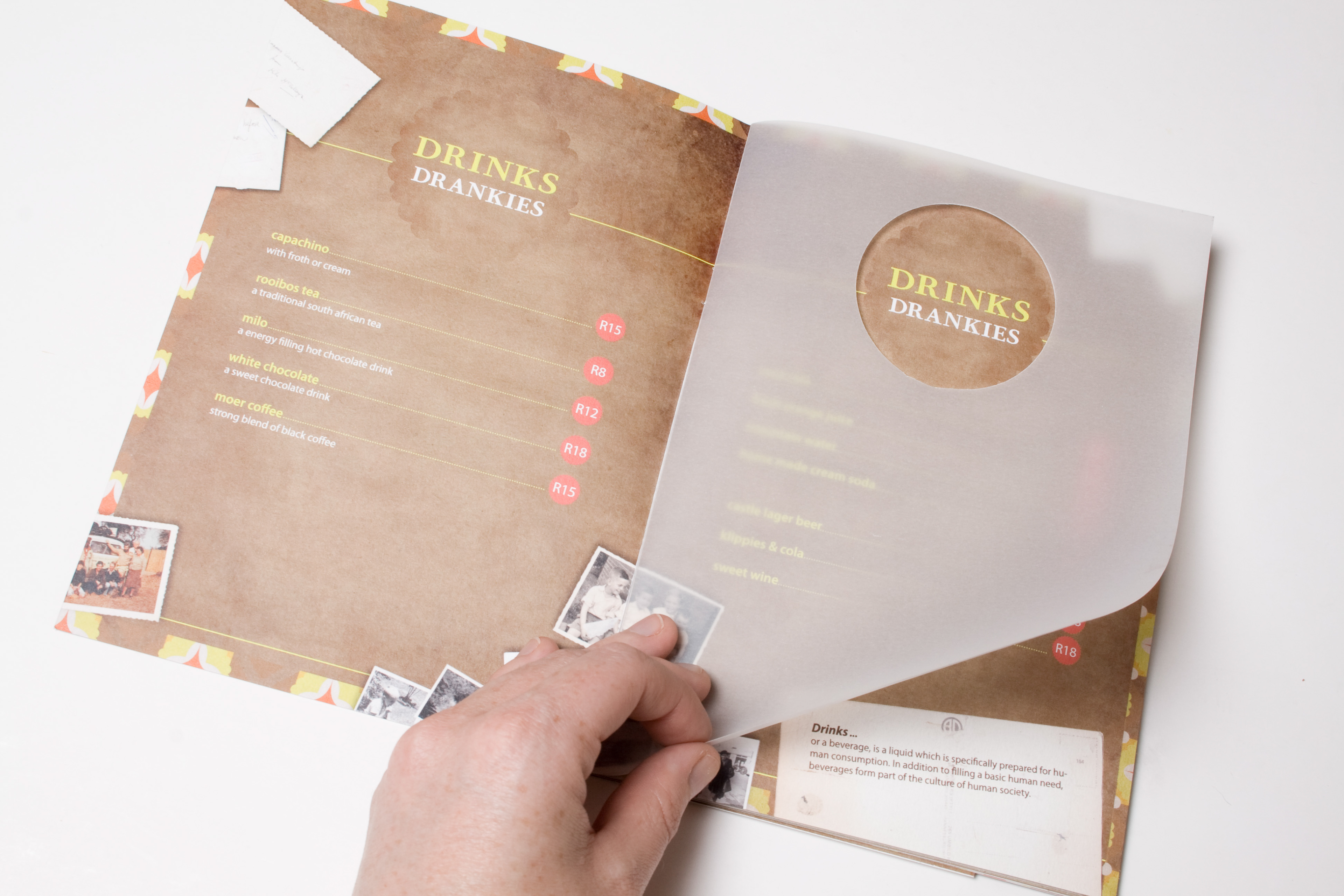
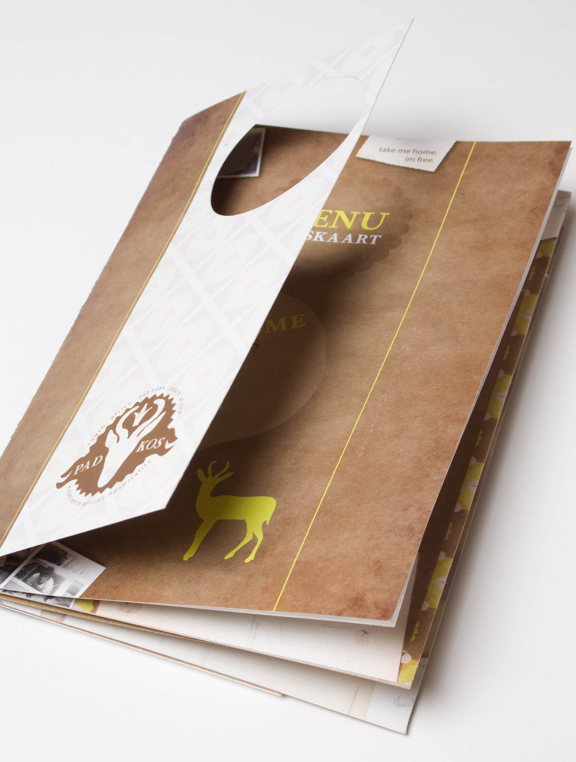
Menu